Today I spent many hours getting ready for a presentation I am doing this weekend for the investing discussion group I have doing for numerous years now. My presentation is on the Callan Periodic Table of Investment Returns, which I alluded to a few months ago as an inspiration for me to buy Real Estate Investment Trusts (or “REITs”).
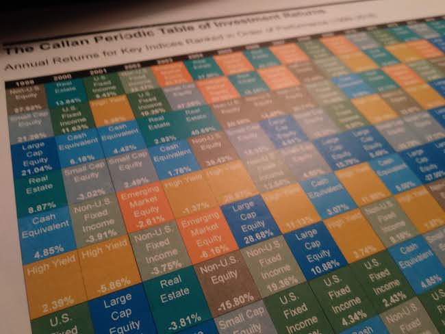
The Callan Periodic Table of Investment Returns is a remarkable thing. It cleverly shows the relative performance of all the major asset classes of investments over the past 20 years in a concise, informative table, namely this:

Firstly, it should be said that the different-colored boxes on the table represent the following nine major asset groups (each asset gets its own color):
- Large Cap Equity ( the BIG companies that comprise the S&P 500).
- Small Cap Equity (smallest stocks in the broader market)
- Non-U.S. Equity (Stocks of companies outside of the U.S. in what are considered “developed markets” in Europe, Canada, the Middle East, and the Pacific Region).
- Emerging Market Equity (Stocks of countries considered “emerging markets,” such as China, Brazil, Taiwan, and South Africa).
- U.S. Fixed Income (U.S. government, corporate, mortgage-backed bonds with maturities of at least one year*).
- High Yield (So-called “junk” bonds, these are more volatile than government or investment grade bonds, yet can also provide a bigger return).
- Non-US Fixed Income (Government and investment-grade bonds around the world).
- Real Estate (As the word suggests, these are companies that are specifically engaged in global real estate markets**).
- Cash Equivalent (These are short-term debt from the U.S. Treasury, with maturities less than a year… called T-Bills, I believe).
I realize that this image is small and out of focus (download your own copy here). The main thing to get right now is how the multi-colored column of vertically-ordered squares changes dramatically from column to column (or year to year). The first column in the table represents 1999, the final column represents 2018. Each year the different colors are stacked according to performance, with the boxes at the top representing the highest-performing asset groups and those at the bottom represent the lowest-performing assets for that year.
As this table so brilliantly suggests, every single year there are different assets that come out on top, while others come out on the bottom. Every single asset class has its day in the sun… and its day down a well. There is no one type of investment that always outperforms the others.
I love this table. It clearly addresses on one of the most important aspects of investing: relative performance. In other words, when we invest, we aren’t just looking at how our investment is doing. We are comparing it to other investments! To some degree, that comparison usually has an effect on how we feel about our investments.
The periodic table single-handedly tells you exactly how you would likely feel investing in any of these asset classes over the last twenty years. It shows how the other asset classes stack up against it. Now how’s that for a picture being worth a thousand words (or thousands of dollars)!?
Sure, the table doesn’t predict what will happen in the future (can we say crystal ball, anyone?). But it presents a wealth of information that can be instructive in broadening our perspective. And with further analysis, one can certainly see tendencies among the individual asset classes.
I will probably continue discussing soon what I have gleamed so far from analyzing the Callan Periodic Table of Investment Returns. For now, suffice it to say that it’s pretty darn cool!
*This is an example of something I do not fully understand… bonds, specifically how they work, the different types of bonds, etc. I have repeatedly heard them explained, and I have increased my bond exposure in the past few months, how exactly they operate is still fuzzy in my mind. What I do get is that basically they are debt taken out by governments or corporations… and we can get paid a certain amount based on what kind of debt they are.
**I did not realize until just now that the periodic table of investments actually tracks real estate companies all over the world. My current REITs are VNQ, a Vanguard ETF tracking only U.S. real estate companies. Hmm. Very interesting. I shall investigate future.
